Get started

Quickstart

From sign-up to your first exported component in ten minutes.

This walkthrough takes you from a new account to your first product screen: a responsive layout, a reusable component and a downloaded Next.js project that runs it. It takes about ten minutes and works on the Free plan.

Before you begin

Shippp runs in the browser. Use a recent desktop version of Chrome, Edge, Safari or Firefox. If you want to use fonts installed on your computer, use Chrome or Edge — only they can read local fonts.

1. Create your workspace

  1. Sign up and name your workspace

    After you sign up, Shippp asks for Your name and a Workspace name. A workspace is where your team, your files and your plan live. You can create more workspaces later from the workspace switcher.
  2. Create a file

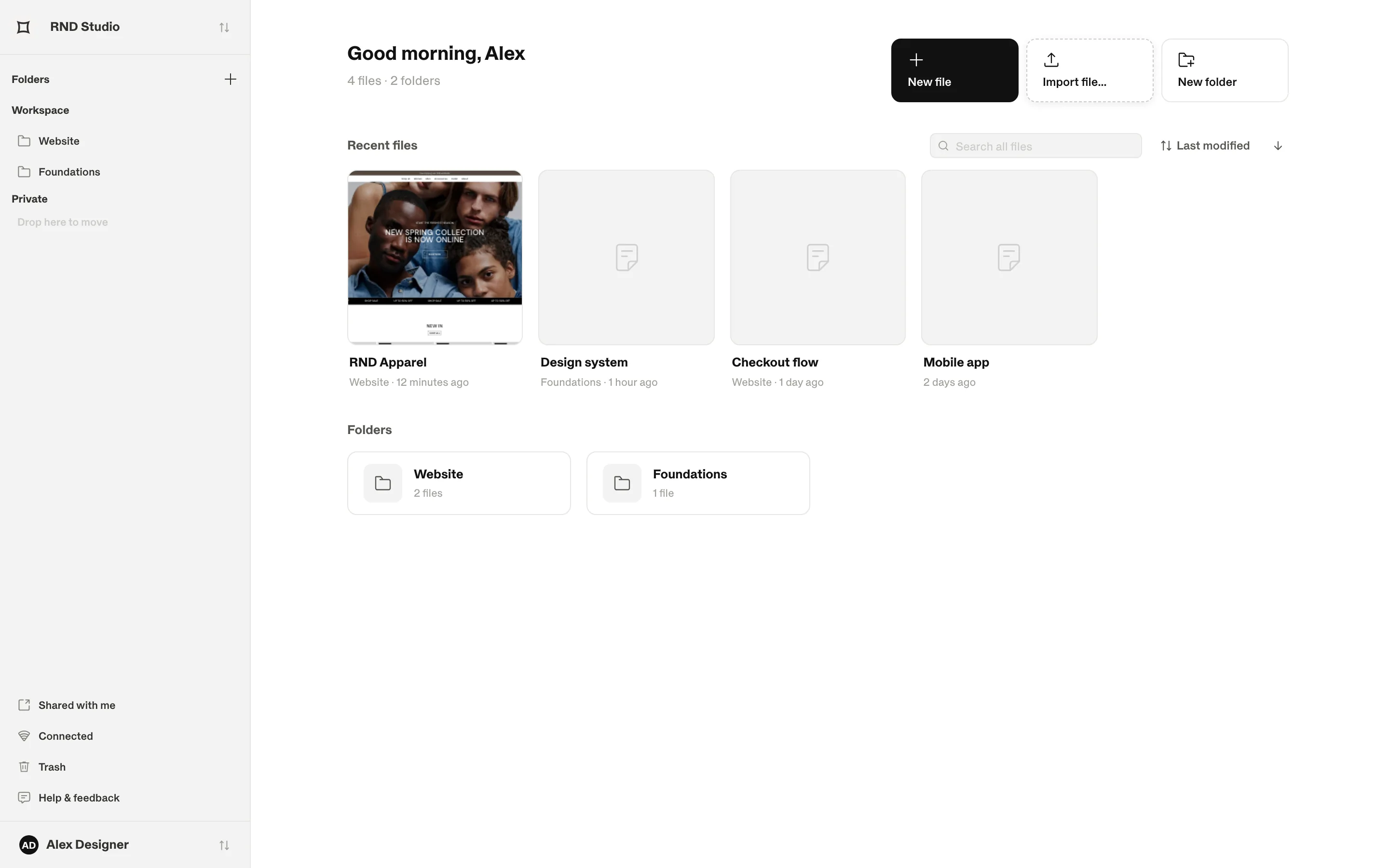
    On the dashboard, click New file. The file opens in the editor with two pages ready: Components and Design.
The dashboard with the New file, Import file and New folder buttons and a grid of recent files.
The dashboard. New file, Import file… and New folder sit in the top right.

2. Draw your first screen

  1. Add a screen

    Press S (Screen) and click on the canvas. A new file starts with a 1440 × 900 Desktop screen. A screen is a page of your product at one breakpoint.
  2. Add a container with smart layout

    Press F (Container) and drag inside the screen. In the inspector, open Layout and choose Vertical. Set Gap to 16 and Padding to 24. Children now stack like a CSS flex column.
  3. Add content

    Press T and type a heading, then another text for the body. Press R for a rectangle to use as an image placeholder, or drop an image file onto the container.
  4. Make it responsive

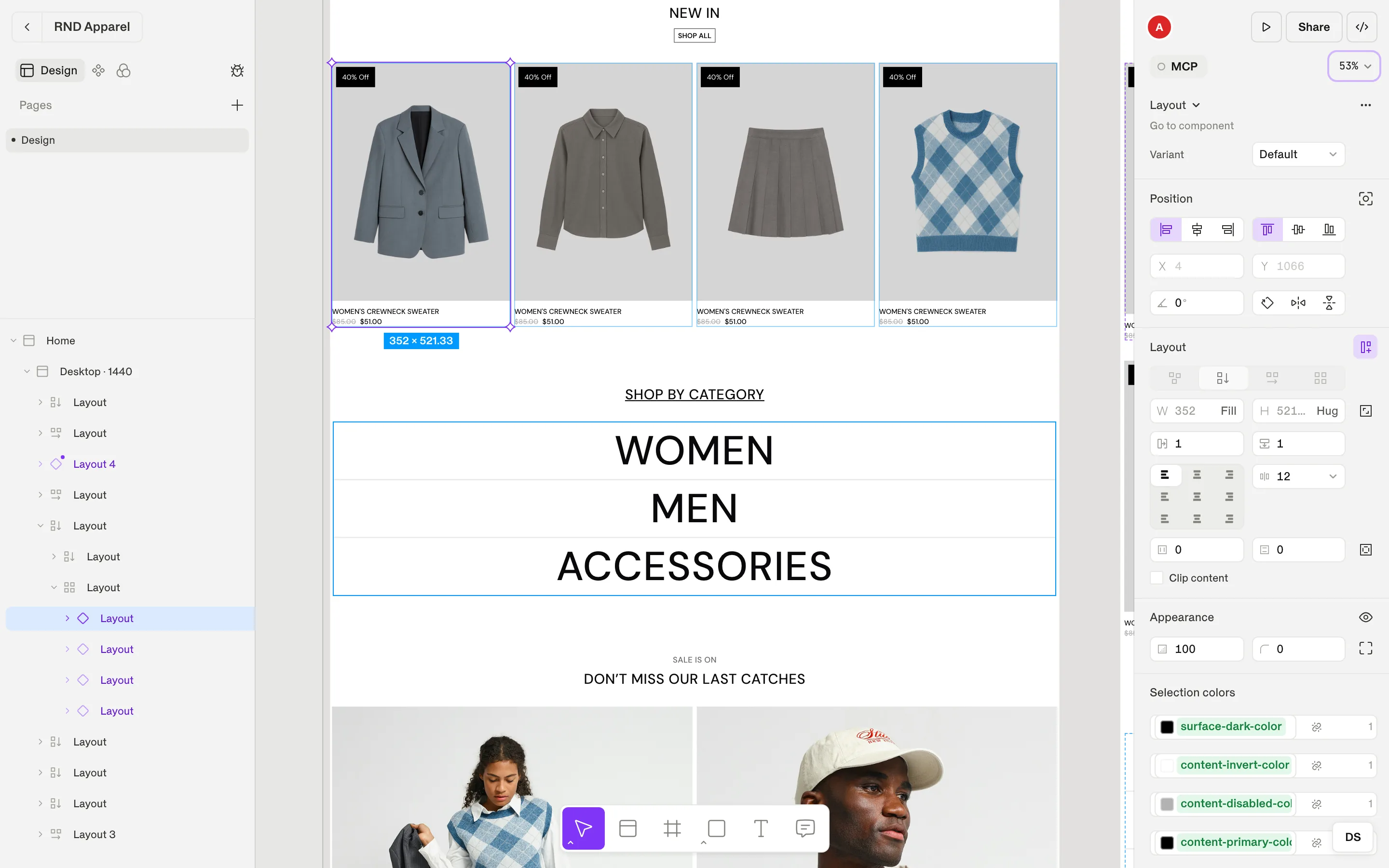
    Select the container, open the width field's menu and choose Fill container. It now stretches with its parent — at every breakpoint.
A product card selected in a grid of cards; the inspector shows its vertical smart layout with Fill width and Hug height.
A product card built with a Vertical smart layout. The inspector shows its sizing (Fill / Hug), gap and padding.

3. Turn it into a component

  1. Create the component

    Right-click the card and choose Create Component. The main component moves to your Components page and the card on your screen becomes an instance.
  2. Add a variant

    Pin the component's Studio with ⌘ P. In the Studio inspector, add a property with + — for example Size with the values Default and Compact — and restyle the Compact cell.

Tip

Every change you make to the main component flows into all of its instances. Instance overrides are marked with a dot and can be reset with Reset to main component.

4. Preview and export

  1. Open the live preview

    Click the play button in the top right (Open live preview). Your screen opens in a new tab as a real web page. Resize the window to watch the breakpoints switch.
  2. Mark the screen as ready

    Select the section that holds your screens and click Select for dev. Code-ready screens are what exports and AI clients pick up by default.
  3. Export

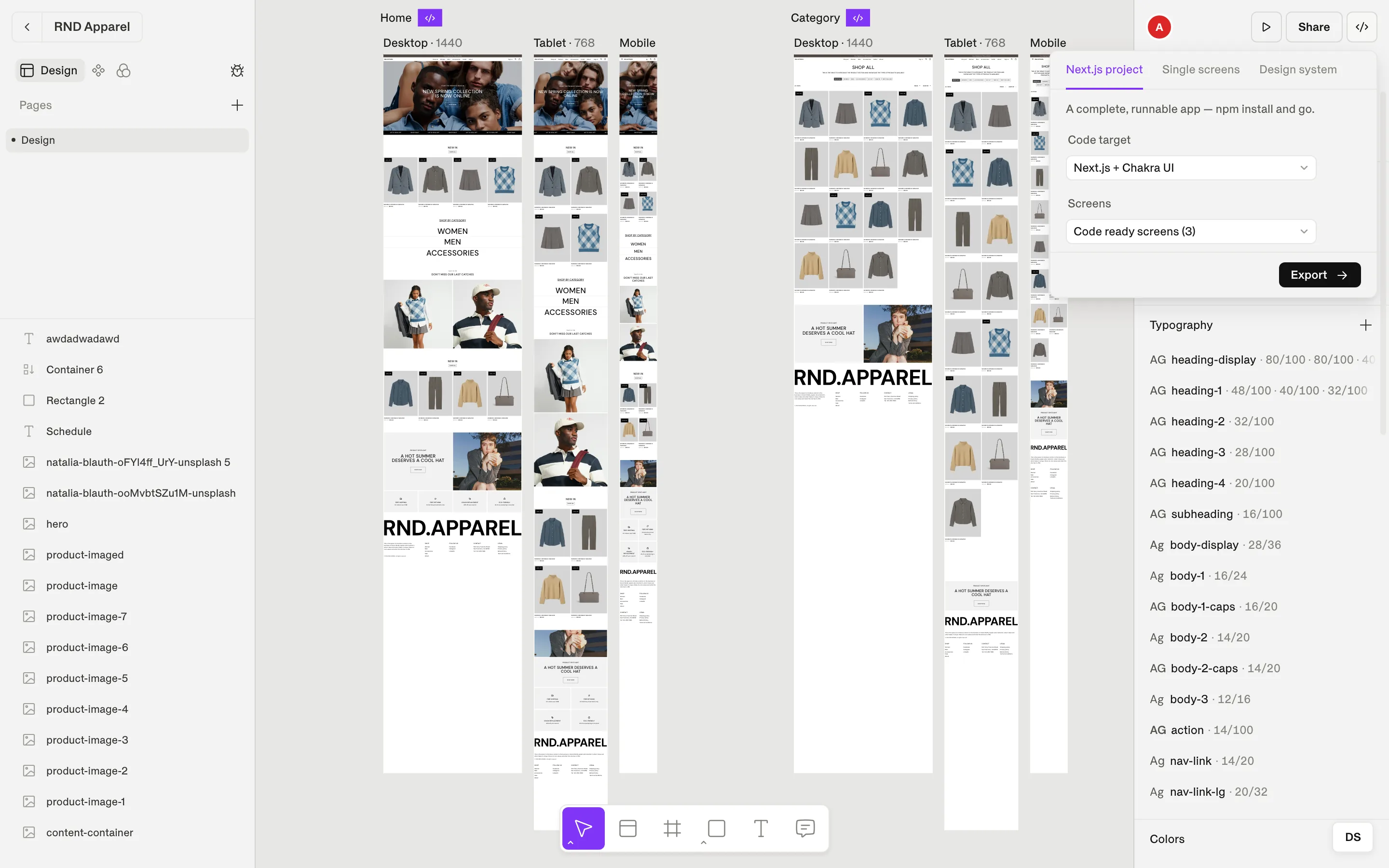
    Click the </> button (⌘ E), choose Next.js project and Next.js + Chakra UI, then Download .zip. Unzip it, run npm install and npm run dev — your design runs locally.
The Export code dialog with Output format, Code target and Screens options.
Export code: pick an output format, a code target and which screens to include.

Next steps

Stuck? See the FAQ or press ? in the editor for every keyboard shortcut.