Design
Screens & breakpoints
Design once and adapt the same screen for Mobile, Tablet and Desktop.
In Shippp you do not design three unrelated artboards for mobile, tablet and desktop. You design one section that holds a screen per breakpoint. The screens share structure and components, and the export turns them into a single responsive page.
Screens
A screen is a top-level frame. Press S and click on the canvas to add one — the default is a 1440 × 900 Desktop screen. The screen inspector shows its resolution and breakpoint.
Right-click a screen for more options:
- Copy link to screen — a deep link your teammates can open
- Move to page…, Zoom to Fit, Hide/Show frame name, Lock/Unlock frame
- Delete Screen
Sections
A section groups the responsive versions of one page. Select the section to see its inspector: its position, the list of Screens, the gap between them and its appearance.
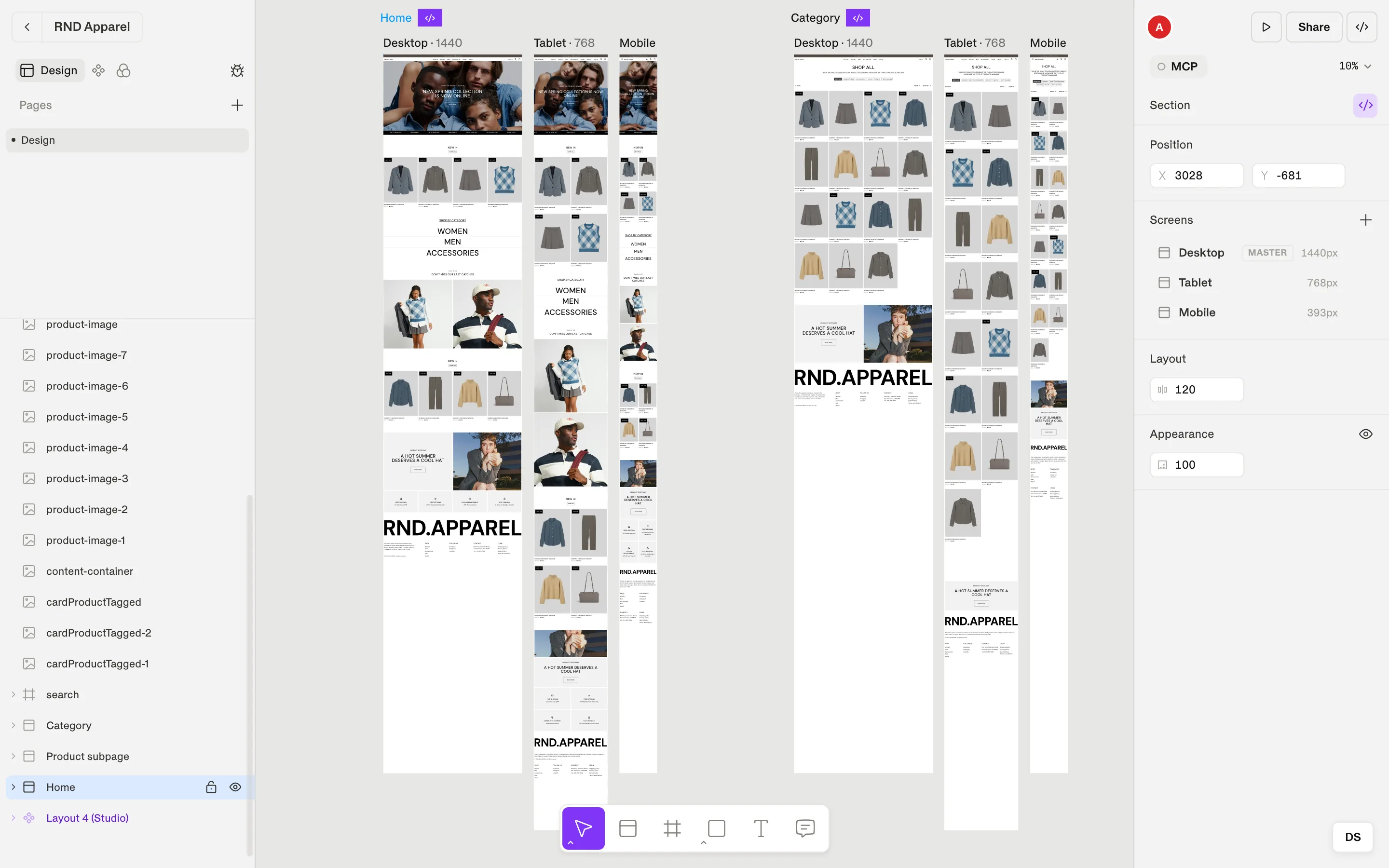
Add a breakpoint version
Select the section
Click the section label above its screens.Add a screen
Click Add screen and choose a breakpoint that is not used yet — or a Custom width, such as 1280.Adjust the layout
Adjust the design for this width — for example stack a row vertically, hide a layer, or change a gap or a font size. Use the same components and tokens across the section so the code stays one responsive page.
Tip
Breakpoints
Breakpoints are part of your design system, so every file can have its own. You find them in Foundations → Breakpoints. A new file starts with:
| Breakpoint | Width |
|---|---|
| Base | The default values, used before any breakpoint applies |
| Mobile | 640 px |
| Tablet | 768 px |
| Desktop | 1024 px |
- Use Add breakpoint to add another one — up to five in total.
- Rename a breakpoint or change its width in the table. The last breakpoint can't be removed.
- Tokens and text styles can hold a different value per breakpoint (see Tokens).
Mark screens as ready for development
When a section is done, click Select for dev in the section inspector (or the </> marker on the canvas). It turns into Selected for dev. Code-ready screens are:
- the default selection in Export code (Code ready screens),
- what AI clients see as ready to build when they connect through MCP.
Note