Design system
Tokens
Colors, spacing and other values with primitive and semantic layers.
Tokens — also called variables — are the named values your design is built from: colors, spacing, sizes, radii, border widths, opacity and shadows. When a layer uses a token instead of a raw value, changing the token updates every screen, and the export uses the same token names in code.
Foundations
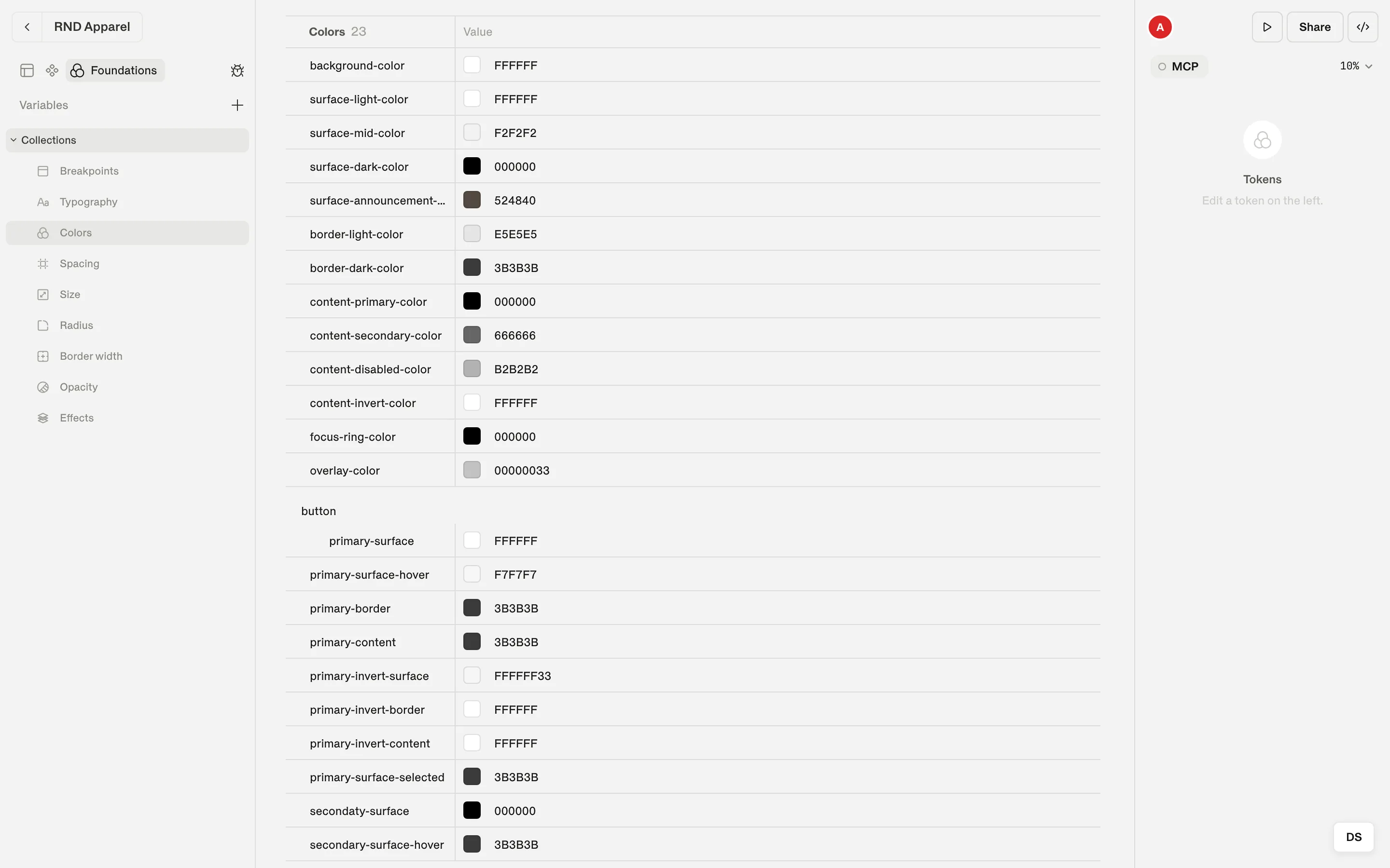
Open the Foundations tab in the left panel. The canvas is replaced by tables of your design system, with a navigation titled Variables on the left.
Primitive and semantic tokens
Shippp uses two layers of tokens, the same model most mature design systems use:
| Layer | Holds | Example |
|---|---|---|
| Primitive | Raw values — your palette and scales. | gray-900 = #1a1a1a, space-6 = 24 |
| Semantic | Meaning. References a primitive (or a value) and is what layers use. | Text/Primary → gray-900, Gutter → space-6 |
Build your palette as primitives once, then point semantic tokens at them. When the brand color changes, you edit a primitive; when a role changes (for example the color of secondary text), you edit a semantic token.
Create primitives
Add a primitive page
In Foundations, click New primitive page (it starts as Primitives).Add a category
Click Color or Number to add a group, for example Gray or Space.Add variables
Use Create variable and fill in names and values. Use slashes to nest groups, such asgray/100.
Create semantic tokens
Semantic tokens live in Collections, organised by category: Breakpoints, Typography, Colors, Spacing, Size, Radius, Border width, Opacity and Effects. Add a token to a category and choose a primitive (or a value) for it.
Create a token from the inspector
Responsive tokens
Switch on Enable per-breakpoint on a semantic token and the row shows one value per breakpoint. A spacing token can be 24 on Mobile, 40 on Tablet and 96 on Desktop — every layout that uses it adapts automatically.
In code, a responsive token becomes a responsive theme value:
theme/semantic-tokens/spacing.ts (exported)
Gutter: {
  value: {
    base: "24px",
    Tablet: "40px",
    Desktop: "96px",
  },
},
Use tokens on layers
- Color pickers have Custom and Libraries tabs. Libraries lists your tokens, split into Primitives and Semantic, with Search tokens.
- Gap, padding, size, radius, border width and opacity fields can bind to the matching token category.
- Detach token replaces the token with its current value on that layer.
Note
Move a design system between files
Use File menu → Export DS to download your design system as .ds.json — either Tokens Only or Tokens + Components. In another file, Import DS brings it in.