Design system
Components & variants
Build masters in Component Studio, add variants and props, and place instances.
Components are reusable pieces of UI. In Shippp a component has a main component with its design, a Studio that shows every variant, and instances you place in screens. Each component exports as a typed React component whose variants become props.
Create a component
Design it with smart layout
Build the element on the canvas first. Use smart layout and tokens — a component is only as flexible as its layout.Create the component
Right-click it and choose Create Component. You will see Component created. The main component lives on your Components page; the original layer becomes an instance.Name and categorise it
Rename it (⌘ R) with a clear, code-friendly name such as Button or Pricing card. In the Components tab, file it under a category with New Category.
Tip
Component Studio
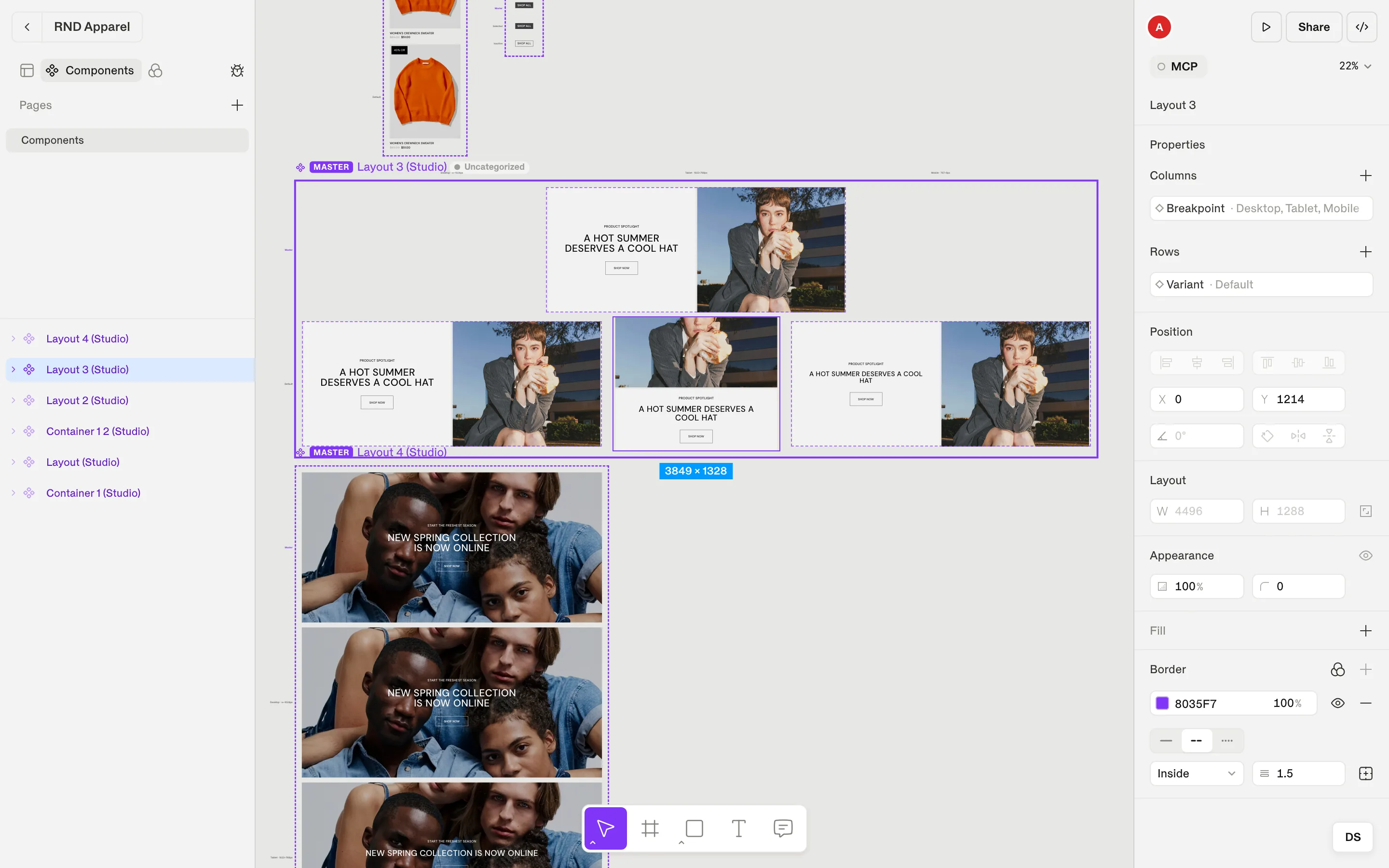
The Studio is a grid of every combination of a component's properties. Press ⌘ P (Pin component Studio) and click to pin it on any canvas; right-click to release. Hide Studio removes it again.
Properties and variants
Select the Studio to see Properties in the inspector:
- Click + to add a property. It is named Property N with a first value Default; rename both.
- Add values to a property — for example Variant: Primary, Secondary, Ghost.
- Properties are arranged as Columns and Rows of the grid. Use Edit property, Remove value or Delete property to reshape it.
- Select any cell and style it to design that variant.
Responsive components
Use Turn responsive on to add a Breakpoint axis to the Studio. You can then adjust the component per breakpoint — a navigation bar that collapses on Mobile, a card that stacks on Tablet.
Interaction states
Hover, focus and disabled are special properties: Shippp keeps their names so they export as real interaction states (for example _hover) rather than ordinary variants.
Use instances
- Hold ⌥ and drag a Studio cell onto a screen to create an instance of that variant.
- Pick variant values for an instance in the Instance section of the inspector.
- Changes you make on an instance are overrides, marked with a dot. Undo them with Reset to main component or Reset to variant.
- Go to main component jumps to the definition. Eject Instance (Detach instance) turns it back into ordinary layers.
Swapping
Swap component replaces an instance with another component, and Swap icon does the same for icons. Use Create instance swap property to expose a swappable slot — for example the icon of a button — as a property of the parent component, with a list of Preferred components.
What developers get
Every component exports as a React component built on a recipe. Properties become props, layer names become slots, and tokens stay tokens. Here is the button used in this site's header, as exported from Shippp:
components/container-8/container-8.tsx (exported)
export interface Container8RootProps extends HTMLChakraProps<"div"> {
  variant?: "default" | "value-2";
  property2?: "default" | "value-2";
}

export const Container8Root = withProvider<HTMLDivElement, Container8RootProps>("div", "root");
export const Container8Text = withContext<HTMLParagraphElement, Container8TextProps>("p", "text");
Every exported project also includes a generated Storybook with a story for each variant, state, breakpoint and swap of your components — so developers and QA review exactly what you designed.
Note
Checklist for a production-ready component
| Check | Why it matters |
|---|---|
| Built with smart layout | It resizes with its content and its parent. |
| Uses tokens and text styles | The code references your theme, not hard-coded values. |
| Meaningful layer names | Slots and props are readable. |
| Properties named by intent | variant="primary" beats property2="value-2". |
| States as hover / focus / disabled | They export as real interaction states. |
| Placed on the Components page | Everyone on the team finds and reuses it. |