Design system
Text styles
Responsive typography that ships as code.
A text style bundles font family, weight, size, line height and letter spacing under one name. Text styles keep your type scale consistent, and in Shippp they can change per breakpoint — so one style covers every screen size.
Create a text style
Style a text layer
Set font, size, line height and letter spacing on a text layer.Save it as a style
In Typography, open Text styles and create a new style. Give it a clear name, such as Heading 1 or Body.Apply it everywhere
Select other text layers and pick the style from the same menu.
You can also create and edit styles in Foundations → Typography, where all styles are listed in a table.
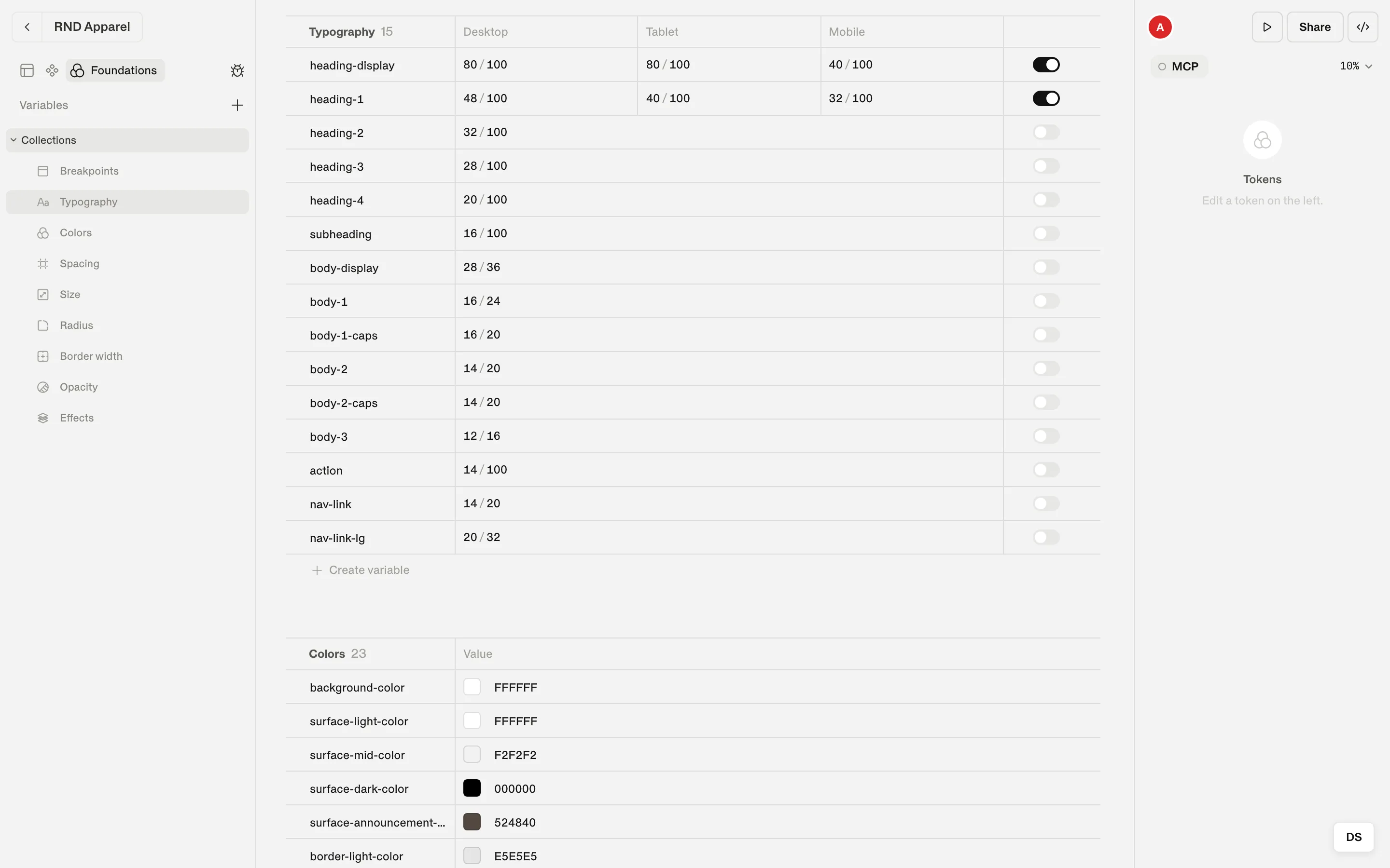
Make a style responsive
Turn on Enable per-breakpoint on a style. The row shows one column per breakpoint, and you can set a different size, line height or letter spacing for each.
| Style | Mobile | Tablet | Desktop |
|---|---|---|---|
| H1 | 32 / 32 | 40 / 40 | 48 / 48 |
| H2 | 24 / 24 | 28 / 28 | 32 / 32 |
| P1 | 14 / 24 | 14 / 24 | 16 / 24 |
The table above is the scale used by this documentation site — built in Shippp and exported as code:
theme/text-styles.ts (exported)
H1: {
  value: {
    fontFamily: "ABC Helveesti",
    fontWeight: "400",
    fontSize:   { base: "32px", Tablet: "40px", Desktop: "48px" },
    lineHeight: { base: "32px", Tablet: "40px", Desktop: "48px" },
    letterSpacing: "-0.02em",
  },
},
Good practice
- Name styles by role (Heading 1, Body, Caption), not by size — sizes change, roles don't.
- Keep the scale small. Six to ten styles cover most products.
- Use Detach text style only for true one-offs. A detached layer no longer follows the style.
- Pick fonts from Google Fonts when you can — they export without extra setup.
Tip
A text style holds typography only. Set the text color with a color token — then a heading can be dark on a light section and light on a dark one while keeping the same style.