Design
Smart layout
Stack, wrap and grid elements the way the browser will — and size them with Fill, Hug and Fixed.
Smart layout is how Shippp understands structure. A container with smart layout arranges its children automatically, exactly like CSS flexbox and grid in the browser. Designs built with smart layout adapt to content and screen width, and they export as clean, responsive code.
Turn on smart layout
Select layers or a container
Select a container, or several layers you want to group.Wrap them in a layout
Press ⌘ G (or ⇧ A), or right-click and choose Smart Layout. For an existing container, use Enable layout in the Layout section.Choose a direction
Pick Vertical, Horizontal or Grid in the Layout section.
To undo it, use Remove Smart Layout (⌘ ⇧ G).
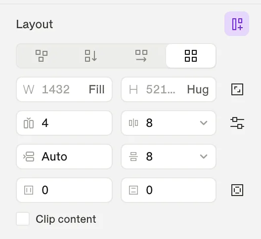
Layout modes
| Mode | Children are… | In code |
|---|---|---|
| Free | Positioned where you put them. | Absolute positioning |
| Vertical | Stacked top to bottom. | flex-direction: column |
| Horizontal | Placed side by side. Turn on Wrap to flow onto new lines. | flex-direction: row (+ flex-wrap) |
| Grid | Placed in columns and rows you define. | CSS grid |
Spacing and alignment
- Gap sets the space between children. Choose Auto (space between) to push children to the edges. When wrapping, you can set a separate row gap.
- Padding can be uniform or set per side (Padding per side).
- The 3 × 3 alignment grid positions children inside the container.
- Clip content hides anything that overflows the container.
Tip
Sizing: Fill, Hug and Fixed
Every layer has a width and a height mode. Open the menu in a size field to change it; the field shows a Fill or Hug badge when it is not fixed.
| Mode | Behaviour | Use it for |
|---|---|---|
| Fill container | Takes all available space in the parent. | Columns, cards in a row, full-width sections |
| Hug contents | Grows and shrinks with its content. | Buttons, tags, text blocks |
| Fixed | Keeps an exact size. | Icons, avatars, images with a set size |
| Apply variable… | Uses a size token. | Consistent widths, e.g. a sidebar width |
| Fit to content (screens) | Grows the screen to fit everything inside. | Long, scrolling pages |
Lock aspect ratio keeps proportions when one side changes — useful for images and media.
Grid layouts
In Grid mode you define column and row tracks and their gaps in the Grid tracks editor. Each child can span several columns or rows with Column span and Row span. Change the number of columns per screen to make a grid responsive — for example 4 columns on Desktop, 2 on Mobile.
Taking a layer out of the flow
Sometimes one element should float — a badge on a card corner, a decorative shape. Select it and click Ignore smart layout in the Position section. It keeps its position and constraints while its siblings keep flowing. Rejoin smart layout puts it back.
Reorder children
Drag children in the canvas or in the layers tree. With a child selected, the arrow keys move it within its smart layout instead of nudging it by pixels.
Constraints in free layouts
Inside a Free container or a screen, constraints decide how a pinned layer reacts when its parent resizes. Horizontal options are Left, Right, Left + Right, Center and Scale; vertical options are Top, Bottom, Top + Bottom, Center and Scale.